Friday, 27 December 2013

More Priority Journal pages

Circles
Who said procrastination was bad? Sometimes, trying to avoid chores produces a very agreeable result.

(Acrylic paint + acrylic ink drippage) 

Summer
This page was created for a Summer-themed challenge. I don't particularly like summer... My operating range is somewhere between 5 and 20°C and temperatures over 30°C damage my brain... Let alone this year's record of 39°C...


And doing a technique that requires blowing through a straw to distribute ink around a page in this heat was beyond "clever".


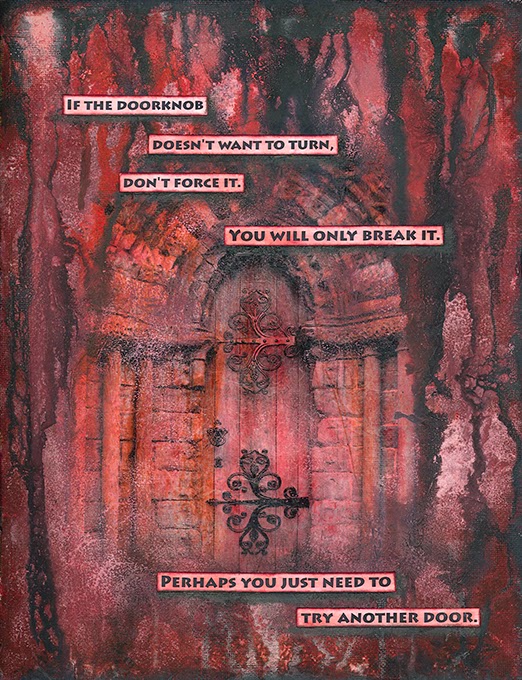
Door
A simple layout using a picture of a door and acrylic paints and inks.


Again, this page started with an image printed on deli paper.
cathedral door in Kirkwall

For more photos from my journal, go to my Flickr page.

More Alpha Journal pages

M is for Minds

[quote by Anna Freud]

U is for Universe

[quote by Arthur C. Clarke]

I used my printed deli paper for background.


V is for Variety
During the process of making this page, I finally learnt to love my Daler-Rowney acrylic inks. It seems I was wrong about them...

[quote by Jean Paul]

X is for uneXpected
(yes, I know, I cheated here but there aren't many words beginning with "X" in English, so I went for the "eX" words...)

[quote by Mark Twain]

It started as a collage of Prima papers.Then I added acrylic paints to tone it a bit down.

For more photos from my Alpha Journal, go to my Flickr page.

Sunday, 6 October 2013

The Other Journal (aka Priority Journal)

I knew I had to do not one but two journals in 2013. That's quite daring considering the number of unfinished projects in my (art) life. But when I was able to complete one journal in 2012, why not two in 2013? 
I planned my second journal to be about my word of the year... My word for 2013 is PRIORITY and I wanted to have a separate journal to work in. As I mentioned in one of my previous posts, I bought a lot of canvas paper for my Alpha Journal - and I found it totally unsuitable and used regular cardstock instead... But I decided to use the discarded canvas paper for my second journal. I cut it to smaller pieces and bound the whole journal myself. 
What was I thinking? The paper curls a lot when wet and it's so frustrating to work on... I also had to strengthen the cover with tissue paper to make it a bit more user friendly. But only a bit...
This is how it looks now. The cover is dirty, I will decorate it once I finish all the inside pages, because I'm messy and I don't want to spend time wrapping the cover with paper every time I want to work in my journal.

the journal

view from the top

The binding is simple – I just made 6 holes in the spine and sew it all together with thread. And it has a flap to hold it closed.   

I painted the first 2 pages and that was about it for a couple of months. I hated that journal, I just couldn't find motivation to open it and start painting.


But I didn't abandon it completely – I used the blank pages to clean my brushes and/or stencils. And... one day... when I got tired of my Alpha Journal, I took it, started to paint and... a couple of pages later... I learnt to love this journal. 


My first double spread in this journal. The size of this journal is 8,5" by 11", so the double page is 17" by 11" and that is a bit too big for me. But I liked the result and now I'm getting more comfortable with this format.


This page was intended for a “Men” challenge but turned out to be something slightly different from what the challenge was about, so I didn't submit it in the end. I used a coarse structure paste through my newest handmade/hand-cut stencils and played with Daler-Rowney FW inks and my latest addiction – the distress paints. 

This page was created for a Faber-Castell June challenge. This challenge was about “what one important lesson have I learnt this year”. I used my hand-cut arrow stencil + structure paste, Daler Rowney FW inks, Ranger Distress Paints and Faber-Castell PITT brush pens. It turned out quite good considering the many ugly phases it went through.
[note to self: Why can't I look at my art as a finished product instead of seeing all that went wrong during the process of its making?]


Zine swap

In March, my online friend Dede hosted a Zine swap. I never heard a word “zine” before but I’m always up for any mischief, so I signed up...
We were to make one original Zine (the theme was “Quote”) and then make colour copies for all the participants. There were several rules – it was supposed to be hand-drawn (as much as possible) the quote was to be handwritten - in short, we were to use as much of our own art as possible.
I decided to go with a silly theme – I chose a funny quote (well, I find it funny) and collaged funny faces (well, I find them funny) all over my Zine. 


I had so much fun making my Zine – and even more fun reading all the Zines that I received.

Journal Page Swap

In January, I took part in a journal page swap hosted by Mandy from Australia. There were 20 of us in the swap in the end and we had till the end of May to post our pages to all the participants.

The rules were these:
  - to create 20 journal pages, all the same size 5x8
  - pages did not have to be identical
  - whatever media or style

As Mandy put it: "...the whole idea of this swap is to have a piece of that person's ART. Their style, their colours, their way." When Mandy first came up with this swap, I signed up for it immediately. I didn't care (that) much about spreading my art, but it was a wonderful opportunity to get art from people I follow on YouTube, U-Stream or on Twitter.

I decided on one layout in three different colour combinations. And this is what I created:

I thought I had an easy page...  I like to work in steps, so I worked on all the pages at once, one step after another. Here are the steps:
1) Ink a sheet of deli paper with distress inks, spray with water, let it dry and then stamp on it with stamps of your choice.
2) Tear the deli paper to pieces and glue the pieces down on a piece of cardstock.
3) Paint the cardstock with acrylics.
4) No background is complete without drippage...
5) Prepare a sheet of paper to use for your focal word - spray it, stamp it, just create a random background. 
6) Cut letters out of the paper.
7) Print the quote and cut it into strips.
8) Edge the strips of paper and the letters with distress ink.
9) Glue the quote and the letters down.
10) Add shading with PITT pens (if you must).
11) Then you will probably find out that the page needs something more and decide to cut out an arrow.
12) Repeat each step 19 times.  
And then the ordeal of addressing all the envelopes and taking them all to the post office...

It was so exciting when the envelopes from all around the world started to arrive. These are the pages I received:
Eileen - Dana - Myrta

Susan - Brenda - Annette

Mandy - Jenny - Lorri

Fiona - Marie - Tanya

Myrta - Charley - Fran - Joyce

Binding:
There was a huge discussion on how each person is going to bind their pages. I created mine with a vision of how I wanted them to be bound. I wanted to use my Bind-it-All – I first considered punching holes into the pages, but then I cut strips of paper to use as hinges which I glued to the back of each page.  Then I could punch holes into the hinges without having to worry about destroying the pages.

the cover

the "hinges"

RIP Kimber
Sadly, Kimber, one of our friends from the swap passed away.  She didn't post her pages but some of us decided to do a page in her honour, to have something to show that she was in the swap
This is my page for Kimber:

Sunday, 14 April 2013

Inspired by Finnabair

I made this canvas for a "Be Inspired Finnabair Style" challenge at Snazzy's blog.


I really love everything Anna Dabrowska (aka Finnabair) creates and I have always wanted to try some of her techniques.
I first applied texture paste through one of my handmade stencils. Then I adhered sequins, some clay pieces, flowers, butterflies and letters. Finally, I sprayed gesso all over the canvas.


I was finally able to purchase some Distress Paints in my country - I bought all the 11 colours that were available and I had to test them the moment they arrived...

Not bad for my first try...

Saturday, 13 April 2013

Alpha Journal - progress so far

This is what I've created so far in my Alpha Journal (in alphabetical order, not necessarily in the order it was painted). For more and better photos, go to my Flickr

A is for Attitude
I was testing my hand-made stencils on this page. I tried to be as random as possible. I nearly ruined (or so I thought) the background by adding the yellow stripes using my hand-carved stamp - I was THIS close to gessoing all over it. I'm glad I didn't. It looks perfect with the faces and the quote and words.
The faces were inspired by my online friend Julia's painting. I'm not an expert on faces and I discovered, when you cut the face in halves, it hides some of the imperfections.

[quote by Winston Churchill]


B is for Books
I really love this spread - the green colour, the background book collage, the white drippage, the quote - everything.

[quote by William Hazlitt ] 


C is for Confidence
This page started with two Celtic circles in texture paste (testing my stencils again) and bright yellow/orange paints. Then I started experimenting with my home-made sprays and it turned muddy and brownish... I tried to save it with some yellow and some doodles, but I don't like the result much...

[quote by Marianne Williamson] 


D is for Discipline (a.k.a. Drippage gone too far)
First, I embossed white cardstock using my Tim Holtz embossing plates. I cut the cardstock to smaller pieces and glued them down randomly. And then I spent some time dripping paint all over it. Drippage can be addicting - the key is to stop at the right time. Well, I didn't...

[quote by Jim Rohn] 

E is for Efficiency (and Effectiveness)
After I printed and hand-cut the letters (aaah, way too many E's and F's...), I discovered I couldn't fit the quote on one side. There were two possibilities: A) to cut the letters again, smaller, B) to split the quote and have it on both sides. I chose B...

[quote by Peter Drucker] 

F is for Frustration
This page was supposed to look completely different  - I can still see it in my mind's eye - but I couldn't recreate it onto paper. This added even more to the frustration I was experiencing at the time of painting. But overall, it looks good.

[quote by Marie Chapian] 

CH is for Chaos
I used pieces of corrugated paper for the background. Then I added coarse paste to add more texture. The rest is paint, sprays and drippage.
Note: CH is a letter in the Czech alphabet - it comes after H and before I.  It is pronounced like in the Scottish loch, or German Bach. When looking up words for my C page, I found out, there are plenty of suitable ones beginning with CH. I just couldn't leave it be so I decided to dedicate one page to CH.

[quote by Dean Koontz] 

K is for Kindness
I used my new hand-cut stencil for the background and acrylic paints.

[quote by Scott Adams] 

Q is for Questioning 
My favourite tissue/deli paper technique on the background + acrylic paints + lots of drippage.  I recorded making of this page for YouTube. But the video needs some editing so I'm not sure when it's going to be published...

[quote by Albert Einstein] 

S is for Silly
I had this "silly" mood for about three weeks - I made a lot of silly collages, inspired by Teesha Moore.
The background is created using Dylusions sprays and my handmade stencils.

[quote by Ludwig Wittgenstein]